

Blog
Exterior Cladding Color Trends for Modern Homes

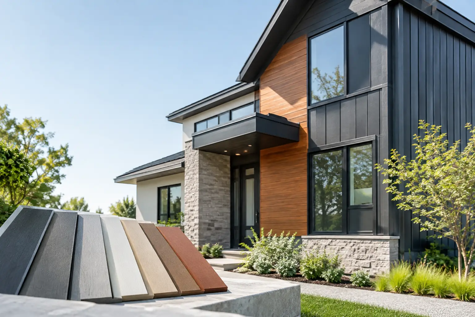
A facade does more than protect a building. It sets the emotional tone before anyone reaches the front door. The strongest exterior cladding color trends are moving away from flat, one-note finishes and toward considered palettes that bring warmth, depth, and lasting architectural presence to homes and commercial spaces.
For homeowners, architects, and hospitality designers, the appeal is clear: exterior color can make a modest elevation feel composed, give a contemporary build a more natural character, or help a renovation sit comfortably within its landscape. The right choice is not simply about following fashion. It is about selecting a finish that will still feel refined after years of sun, rain, dust, and daily life.
Exterior Cladding Color Trends Shaping Facades
The most enduring trend is a return to nature, interpreted with a more polished and practical eye. Rather than trying to replicate every variation found in raw timber, modern composite cladding is being specified in curated wood-inspired tones with consistent color, clean profiles, and a lower-maintenance finish.
Warm browns, grounded charcoals, soft mineral grays, and understated off-whites are leading the conversation. These colors work because they allow architecture to feel connected to its surroundings without competing with landscaping, glazing, stone, or metal details.
Warm wood tones bring depth without heaviness
Wood-inspired cladding remains a defining choice for contemporary exteriors, particularly in shades of oak, walnut, teak, and smoked brown. These finishes introduce the visual comfort of timber while avoiding the demanding maintenance cycle associated with natural wood.
A warm timber tone is especially effective on entry walls, covered patios, upper stories, feature volumes, and outdoor entertainment areas. It softens hard-lined architecture and creates an immediate sense of arrival. In hospitality settings, it can make a restaurant terrace, boutique hotel facade, or reception approach feel more inviting before guests even enter.
The key is restraint. Covering every surface in a dark wood finish can make a large facade feel heavy, particularly where there is limited natural light. Pairing timber-look composite cladding with pale render, stone, or charcoal framing creates contrast and lets the texture do its best work.
Charcoal and black create architectural confidence
Deep charcoal remains one of the most influential exterior cladding color trends because it provides instant definition. It is crisp, contemporary, and remarkably flexible. Used around windows, on a projecting volume, or across a garden-facing elevation, charcoal cladding can make a building look more deliberate and visually settled.
Black is not always the right answer, however. On a small home in an intensely sunny location, a fully black facade can feel severe and may show dust or water marks more readily than a mid-tone finish. Charcoal is often the more forgiving alternative, offering depth without the starkness of pure black.
Dark cladding works beautifully with warm lighting, pale concrete, natural stone, and timber accents. It also suits commercial projects where a premium, minimal identity is needed, from office entrances to retail fronts and restaurant exteriors.
Soft neutrals make modern design feel timeless
Warm gray, mushroom, sand, taupe, and muted greige are becoming preferred alternatives to bright white and cool concrete gray. These shades give an exterior a calm, architectural quality and are easier to live with than sharp whites, which can emphasize dirt, staining, and uneven weathering.
Soft neutrals are ideal for larger expanses of cladding because they create a quiet backdrop for more expressive elements. A richly grained wood-look panel, black aluminum window frames, textured paving, or planting can then take center stage without making the facade feel busy.
For renovations, neutral cladding is particularly useful when the existing roof, brickwork, or stone cannot be changed. A carefully chosen gray-beige tone can bridge older and newer materials, helping the building feel cohesive rather than patched together.
Two-tone facades feel more tailored
One color across every wall can be elegant, but tonal layering is increasingly the more design-led approach. Designers are combining a neutral main cladding color with a darker plinth, a timber-inspired feature zone, or a contrasting frame around an entrance.
This approach gives a facade proportion. Darker colors can visually ground the lower level, while lighter finishes can lift upper stories or make compact spaces feel more open. Wood-look panels are often used where the eye naturally pauses: around a front door, beneath a canopy, beside a pool, or along a sheltered terrace.
The most successful combinations usually involve two colors, occasionally three materials. Once every surface demands attention, the sense of luxury is lost. Let one finish lead and allow the other to provide structure or warmth.
How to Choose a Cladding Color That Lasts
Trend awareness is useful, but exterior color selection should begin with context. The same walnut finish can look warm and elegant against creamy stucco, yet appear almost black beside red brick. A charcoal panel that feels sophisticated on a leafy site may feel too stark in an open, coastal setting with strong glare.
Start by looking at the fixed elements: roof color, window frames, paving, boundary walls, stone, and neighboring structures. These do not all need to match, but they should belong to the same visual family. Warm roof tiles generally work best with warm or neutral cladding. Cool gray metal roofing can support charcoal, weathered gray, or balanced taupe finishes.
Light matters just as much. Request samples and view them outdoors at different times of day. Morning sun, harsh midday light, shade beneath an overhang, and warm evening light can all alter the perceived color. This is particularly important with composite wood panels, where grain texture and surface relief add another layer of variation.
Consider orientation and local conditions
A south- or west-facing wall may receive strong sun for much of the day. Dark colors can look striking here, but they will absorb more heat than pale finishes. That does not automatically rule them out, especially when the cladding is installed within an appropriate ventilated system, but it should shape the specification and the location of feature areas.
In dusty, rainy, or coastal environments, mid-tones are often the practical sweet spot. They tend to disguise everyday surface marks better than very pale or very dark finishes. A durable outdoor composite cladding product also reduces the maintenance burden of preserving a consistent appearance, making it easier to enjoy the design rather than continually manage it.
Match the color to the scale of the building
Color changes perceived proportion. Lighter cladding can make a narrow facade feel broader and a small courtyard feel more open. Darker finishes can recess a garage door, visually lower an overly tall wall, or turn a simple boxy volume into a strong focal point.
For large commercial elevations, avoid treating the whole facade as a single canvas. Break the surface into zones with color, profile direction, or material changes. Vertical cladding can make an entrance feel taller, while horizontal lines can give a long facade a more grounded, expansive appearance.
Texture Is Part of the Color Story
Color cannot be separated from texture. A smooth charcoal panel reads differently from a deeply grained charcoal wood finish, even when the base color is similar. Texture catches light, introduces shadow, and gives a facade the visual richness that paint alone often cannot achieve.
This is one reason wood-look composite cladding has become such a compelling choice for modern exteriors. It offers the warmth and rhythm people associate with timber, while supporting a more consistent finish and practical performance in exposed settings. At Inspiration Wood, outdoor composite panels allow designers to use this natural aesthetic across feature walls, patios, facades, and garden-facing spaces without making upkeep the price of good design.
Profile direction matters too. Vertical boards feel contemporary and tailored, while horizontal boards often create a calmer, more expansive effect. The color may be the same, but the finished impression can be entirely different.
Avoid Chasing a Trend Too Literally
The most shareable facades often have one thing in common: they feel personal to the architecture and place, not copied from a passing image. A dramatic black exterior may be perfect for a sculptural new build, while a soft taupe-and-oak composition may better suit a family home designed around outdoor living.
Choose a color you will be pleased to see in every season, then use trend-led accents where change is easier. A feature wall, screen, entrance surround, or entertaining area gives you room to be bolder without committing the entire building to a short-lived look.
The best exterior cladding color is the one that brings the building into focus – warm where it needs welcome, dark where it needs definition, and practical enough to keep its refined finish long after the project is complete.